how to make data-driven customer segmentation with Excel
Step-by-step guide to create an actionable data-driven customer segmentation and analyze it by using only with excel or Google sheet. To complete this tutorial, you need data about your customers, the time and the amount of their purchases and a good 15 minutes of focus.
Customer segmentation is crucial information for marketers. Indeed, it is difficult to make individual communication as soon as you have more than 20 customers, and even harder to spot your best customers in one blink.
Interestingly enough, the method to do customer segmentation differs widely from one industry to another. In the marketing world, it will often boil down to a post-it session coupled with gut instincts. But from my experience, it doesn’t create insights that are not actionable in day-to-day operations.
On the other hand, the academic world has, since more than 10 years, covered data-driven segmentation methods. The most known segmentation is the RFM analysis, a classic case-study for young data apprentice, but almost unknown from the top marketing experts.
So I decided to break the wall between these two silos and create a data-driven method using a tool that the marketers master as much as the data guys: Excel.
Excel is far to be my favorite tool, but it stays the most used tool for data analytics in the world. As a data scientist I challenged myself to walk in the shoes of the marketer by using only Excel, where I would usually use other tools.
What I thought would have been a stroll, was actually a stroll with a twisted ankle through a jungle forest. But now, the path is laid and signposted so following it will indeed be a stroll.
I will here work with Shopify data but the steps are the same for every e-commerce platform. Arm yourself with an excel, and let’s dive into this 15 minutes stroll.
Here are the steps:
- Import data
- Clean data
- Merge data
- Transform data
- Plot data
- Analysis
- BONUS: Going further with Machine learning
1. Import data
Before starting importing the data, it’s important to know what we need. Our goal is to create one RFM profile per user. RFM stands for:
- Recency: when did they buy last
- Frequency: how many orders did they make
- Monetary: How much money did they spend in total
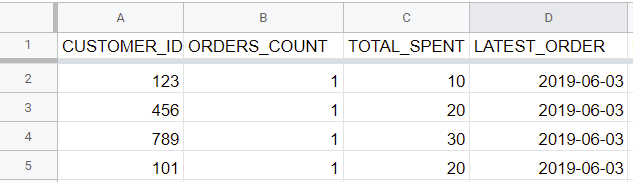
By compiling these 3 characteristics for each user, we can easily segment them. Now let’s fetch the data we need for this analysis. Importing the right data is an easy and well documented step. For instance, Shopify helps you to download a CSV of your orders and customers. And Woocommerce allows it with plugins.
While creating the export, it’s important to have the following data:
- In the customer file:
- customer_id or id
- order_count
- total_spent (or, for other platform than Shopify, the sum of every euro spent)
- In the order file:
- customer_id
- order_date
Now we need to put this CSV in a classic Excel format. This can be done easily in Excel and Google Sheet:
- Excel: Data > import CSV
- Google sheet: Open with Google sheet. If you see only rows and one column, Data > split text into columns
2. Cleaning data
This very important step will avoid cluttered data and “bad” data. We will perform the same in the two separates sheets.
First of all, just put the data files in two sheets of one excel. This will greatly simplify the work. So we should have two sheets:
- the “FM” (for Frequency and Monetary) sheet with customer_id, order_count and total_spent
- the “R” (for Recency) with order sheet with customer-id and order_date.
2.1 Getting rid of the clutter
For the sake of the exercise, we will start by uncluttering the two sheets. Simply open the excel and remove all the columns to only keep:
- On the 1st sheet “FM”:
- customer_id
- orders_count
- total_spent
- On the second sheet “R”:
- customer_id
- order date
For the sake of simplicity, let’s remove discount, taxes and shipping columns as they are already included in total_spent.
Be certain that the customer_id is properly linked to the right person. To do so, have a list customer_id and name on the side (for instance, a shopify tab open in the browser) and cross-check to avoid using another id (such as order_id).
After removing the unnecessary columns, we will remove the missing data:
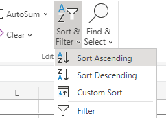
- Press A -> Z and Z->A in each column to make the empty cells appear on top.
- For each column decide to remove the empty cells/outliers.
By simply performing this sort ascending/descending, we will unveil the extreme lows and highs. This already gives very valuable business insights. For instance, in my case I quickly realized that:
- We lost money (negative total_spent) on 0.2% of the clients. It’s a marginal amount so I will just delete these rows.
- 6.3% of the clients paid 0. That’s to be removed too. It’s worth keeping in mind to re-target them, but let’s keep that out of this analysis.
- 0.06% had zero order, but had still paid some money. That’s probably interesting to raise in the team. But again, it’s out of the analysis so I removed it.
- Also, I got rid of your team members. Check in Shopify their customer number and remove them from the list, as it was probably test orders.
- I found one outlier who was 450 times the average order price. I double checked to verify that it was not a mistake but not, it was well a real client.
2.2 First data transformation
2.2.1. Recency
We’ll first take care of the 2nd sheet: Recency. Our goal is to transform it and have as results two columns: the customer_id and the date of their last order. In other words, how recently they bought.
A. Change data type
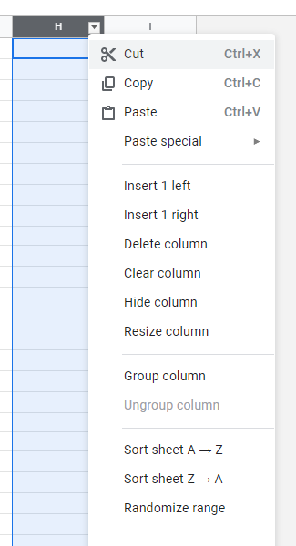
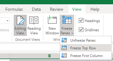
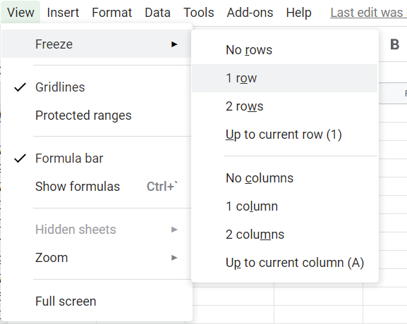
First we will change the data type from number to date. In order to do so start by freezing the first row, that will make the work easier (View>freeze first row)
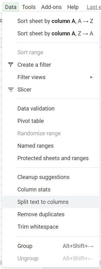
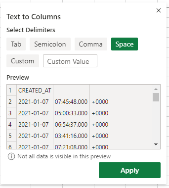
Then we have a small hiccups: Shopify writes the data with a +0000 representing the hour offset. For our exercise we will just keep year, month and date, so we need to get rid of it. To remove it use Data> split text to column (detect automatically) to remove the +0000 and the hour.
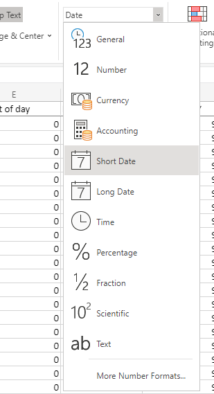
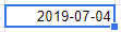
Once this is done, it’s really easy to change the format year-month-day in date format.
B. Sorting max order
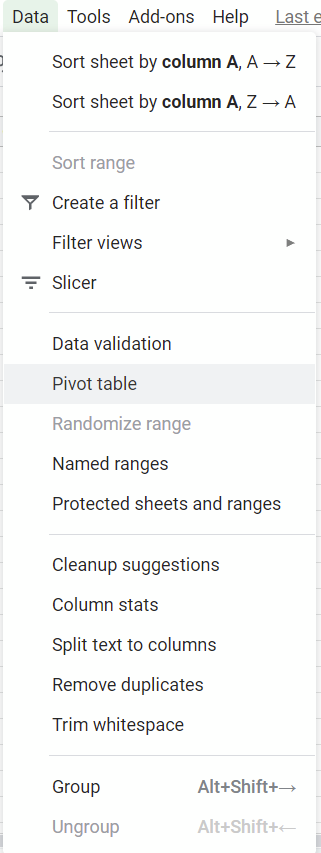
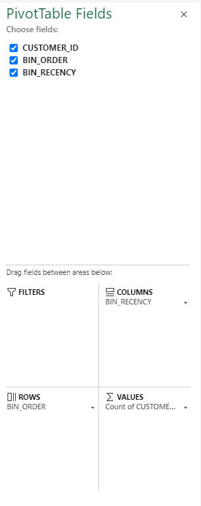
We will have to create a pivot table for this. Let’s start by selecting all data. Then press Data>pivot table. We’ll make it in a new sheet
A pivot table is a table of statistics that summarizes the data. Concretely, we have now all the dates of all orders, but just want the latest date per customer.
For excel, those are two simple steps:
And for the Google Sheet users, it’s a bit more complex:
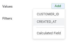
When we create our pivot table, a panel will appear on the left. We need to format our pivot as follow:
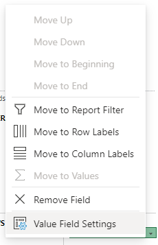
– Row: add > customer_id
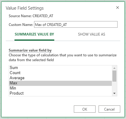
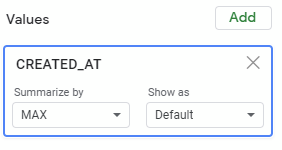
For the value it will be slightly harder. We need to have the latest date, or in numerical language, the max date.
– Value: max(created_at)
In case you have more than 50 000 customers, you will see this appearing.
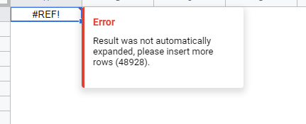
No big deal. Just scroll until the bottom of the excel sheet and click “add x more rows” depending on the amount of customers.
And now we see, on the excel or Google Sheet, a date for each user. This is the date of their last order. Congratulations, you have already very valuable information as such! You are getting closer to your data-driven customer segmentation.
3. Merging the sheets
Our final goal is to have one sheet with the 3 dimensions R, F & M per customer. In this step, we will merge all data in one sheet, which requires something slightly more complex than a simple copy-paste.
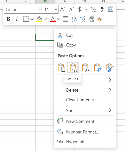
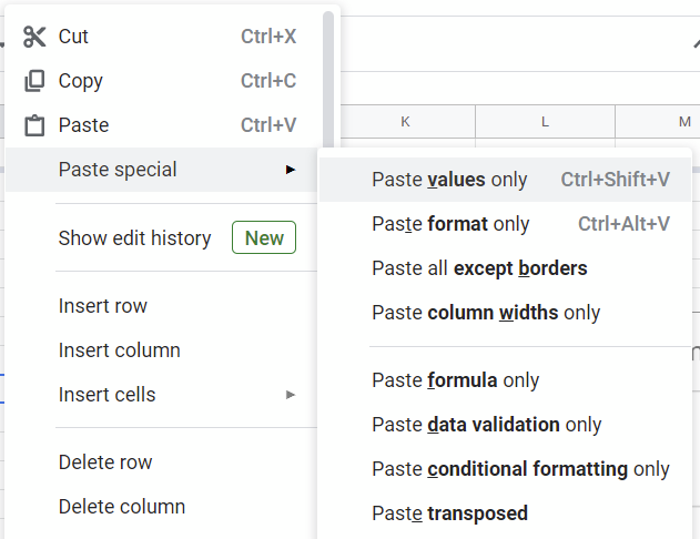
Going back to our Recency sheet, we want to get rid of the formula attached to the cells and just work with the values. A simple way to do so is to copy your whole value and then paste the values only. Copy the values in a new sheet and call it “R_values”; it will help us later.
Now we want to merge these two sheets that we have. The great thing is that in both sheets, the “RM” and “F”, we have a customer_id. That’s what we will use as anchor with the VLOOKUP formula.
We will write this formula in the second cell (as the first cell if for the name of the column) of the 4th column of our customer sheet. It goes as such:
= VLOOKUP(A2,R_values!A:B,2)
Out of this formula, if you followed the previous steps, don’t have to change anything. Still here what the arguments mean, in order:
- A2 = my first variable (=the first customer_id)
- R_values = the sheet where we pasted the value from the pivot table. It is followed by !A:B which means that we take the 2 first columns.
- 2 = the index (= the name of the column of the value to pick, here it’s 2 as the 2nd is the one with the date of the latest order).
And after we did it for one cell, we just need to double-click on the corner of the cell to extend it for all cells of the column.
All rigth we are all set! We have now one beautiful clean sheet with 4 columns: the customer_id, the order_count, the total_spent and the last one that I named “latest_order”. We are reaching the end.
4. Transforming the data
Remember that the goal is to give 3 score per user:
- Monetary score: how much they paid
- Recency score: how recently did they purchase
- Frequency score: how many order did they do
But these scores, unless grouped together, will stay individual characteristics and not actionable segments. So we will need to create brackets of scores and merge them to create a handful of customer segments.
4.1 Recency groups
We have the date of the latest order, and want to transform that in a score. We will thus convert the latest date in a column representing the amount of days since the last order.
It’s a very simple manipulation: we create a 5th column “Amount of day” where we write in the second cell (starting from the top):
= Today() - D2D2 is here the first cell of the last_order column. We right click on the bottom right corner of the cell to extend it and here we are! Furthermore, we will create 3 clusters of users:
- Recent: if they purchased in the last 3 months
- Former: if they purchased between 3 and 12 months ago
- Past: if they purchased more than a year ago
Simply paste the following in the 6th column “Recency segments”:
= IF(E2 <= 90, "Recent", IF(AND(E2 > 90, E2 < 365), "Former", "Past"))Small note for data about EU citizens: After 365 days, it’s even worth looking whether you can still contact them, as the GDPR might prevent you from doing so.
4.2 Frequency groups
As we did for recency, we will create groups of users for the Frequency:
- One-time: if they purchased once
- Repeating: Between 1 and 3 purchases
- Recurring: Above 3 purchases
= IF(B2 = 1, "One-time", IF(AND(B2 > 1, B2 <= 3), "Repeating", "Recurring"))Just take care to verify that the column B is well the one for ORDERS_COUNTS and that you cleaned the customers well with 0 purchases.
4.3 Monetary groups
This section will highly depend on the products you are selling. Whether you are selling unique items or a collection will create huge differences. As such it’s up to you to decide what the categories are. Here is an example:
= IF(B2 <= 10, "Small buyer", IF(AND(B2 > 10, B2 <= 50), "Convinced user", "Top customer"))
4.4 Pivot: From individual score to grouped view
The next step is to transform this individual data in a grouped view. As we don’t need the individual data per customer but well the aggregation of the different groups, we will sort it out with another pivot.
It’s up to your business choice to create a pivot table using Recency on one side and with Frequency or Monetary on the other (or both one after the other). Unfortunately Excel and Google sheet don’t allow 3 dimensions graphs, so we can’t plot R, F & M in one graph. I would recommend to use Recency and Frequency as they are more actionable.
Here are the settings you need to use:
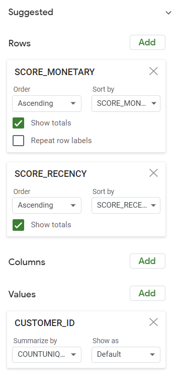
I personally like very much to have values only. It allows us to work on the data without risking that a change will wreck our calculation. So once I have all these values from the pivot, I copy-pasted (values only) it in a last sheet called “Final results”.
5. Plotting the data
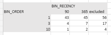
We are now at the very exciting moment where you can see the reality hiding behind the numbers! Our final sheets has a 3×3 grid looking as such:
And Voila! Here is our graph plotting our customer segmentation! Playing a bit with the graph parameters will give you such a picture.
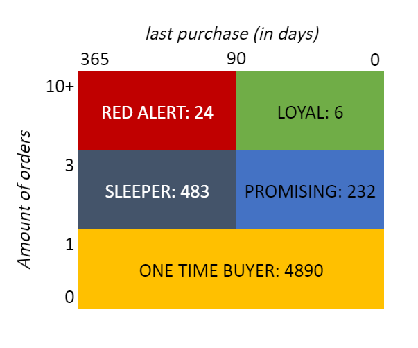
Note: I will pretend that I made this graph by plotting our data when in reality I colored the background and typed my answer in. But who would see the difference right?
6. Analysis
Now what does this beautiful graph say?
Red alert: The are 24 customers that you need to call now! If they leave the boat, that’s the bottom line who will drown.
Loyal: There are 6 persons which you may want to send a business present (pick a random occasion for it), but don’t seem to require more attention.
Sleeper: 483, that’s the amount of email with a coupon that you will send. And hopefully you can bring them back in the promising group.
Promising: These 232, they are just to be watched. And why not send a small emails with news from time to time.
One time buyer: From the 4890 ones who gave their email consent, send them love! And why not a bit retargeting, they will be cheaper to reconvert that new users anyway.
7. BONUS: going further with machine learning
I have touched quickly on what excel cannot do. For instance a 3D graph, or a clustering of more than two dimensions. Here they are:
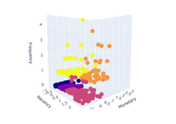
This beautiful above example shows what Machine Learning can do for marketing! You can see here the 5 groups of users, splitted by the algorithm and plotted on a 3D graph. Great Data Scientists cover this (more technical) project already, in case you feel like coding it through.
Why is that so much more exciting? Because of the new insights! Look at the red groups of users, who bought recently for little money VS the yellows which are the users to be kept at all costs! Difficult to have a more actionable data-driven customer segmentation, you just have to define 5 ways to approach these groups!
I hope you had as much pleasure doing this exercise as I had to create it and write it down.
If you are interested in more articles on the topic of “Data for Growth”, don’t hesitate to register for my newsletter.
If you would like to work with me don’t hesitate to contact me on Linkedin