
Forecasting web traffic with Python and Google Analytics
Showing the future to business managers: A step-by-step to create a time series prediction of your web traffic plotted as a GIF.
SolarPanelCompany decided to hire their first Data Scientist: me. I was quite excited by the challenge of having to build everything from scratch. My goal was to get a first quick win to show my value to the team.
In the first week, a marketing manager came to your desk panicking: “Look!” he says by pointing at the screen of his laptop “On Google Analytics, I see our traffic went down during the last month! Can your Prediction Data Learning stuff do something to save the business?”.
“Alright,” I think “that’s not the real question here.” So I rephrase: “Are you asking me to show whether we have a downwards trend or just a seasonal effect?”. He stares blankly. “Are you asking me to verify when we can hope that it will go back upwards? – Yes! Exactly that! I have a meeting with the Marketing Director tomorrow. I let you work on that!”
If this situation happened to you, or if you want to create the visual forecasting of your own web traffic, you are on the right page! Here is the step-by-step guide to creating a prediction of the number of visitors to your website based on your Google Analytics data and, as a bonus, make it a likable GIF for the business guys. In short, we’ll create a time series model with the Prophet package.
This guide includes 3 steps:
- Calling your Google Analytics API data with Python
- Building your model with Prophet
- Creating a GIF of your prediction (because it’s fun)
1. Connecting to your Google Analytics API
Needed for this step: admin right to a Google Analytics account. If you don’t have any, you can use a demo Google Analytics account and simply import the data in a csv.
This is not an easy step, but Google created a lot of documentation to help you go through. I will here present the step-by-step guide to fetch the traffic. If you are interested in other metrics (such as goals, pageviews, etc.) you need to have a look in the extensive official Google’s Management API documentation.
Let’s import our packages:
import pandas as pd
from apiclient.discovery import build
from oauth2client.service_account import ServiceAccountCredentials
The first package is our eternal friend Pandas. The two last packages are from Google and allow you to call the Google Analytics API.
If you don’t have access to the Google API yet, you need to activate that on your side. The below video explains all the steps to do so.
So let’s start the fun. Our first piece of code is calling the key and the right view. Note that the view number can be found in your Google Analytics account under “setting>view”
SCOPES = ['https://www.googleapis.com/auth/analytics.readonly']
KEY_FILE_LOCATION = 'ga-test-api-111111-111111111111.json' #this should be replaced by your key document.
VIEW_ID = '193585107' #this is my own view ID and should be replaced by yours.
In the above part, the first line doesn’t change, but the 2nd and the 3rd have to be changed with your own access keys.
Now we will use the code from Google API’s documentation. If you don’t understand it all, it doesn’t matter: copy-pasting it will do the job if you modified properly the paragraph above.
#Initializing report
def initialize_analyticsreporting():
  credentials = ServiceAccountCredentials.from_json_keyfile_name(
      KEY_FILE_LOCATION, SCOPES)
  analytics = build('analyticsreporting', 'v4', credentials=credentials)
  return analytics
#Get one report page
def get_report(analytics, pageTokenVar):
  return analytics.reports().batchGet(
      body={
        'reportRequests': [
        {
          'viewId': VIEW_ID,
          'dateRanges': [{'startDate': '600daysAgo', 'endDate': 'yesterday'}],
          'metrics': [{'expression': 'ga:sessions'}, {'expression': 'ga:Pageviews'}],
          'dimensions': [{'name': 'ga:Date'}],
          'pageSize': 10000,
          'pageToken': pageTokenVar,
          'samplingLevel': 'LARGE'
        }]
      }
  ).execute()
We can see above the mention "metrics". On my side, as I wanted to do a time series I cared only about the traffic dimension but also imported the Pageviews for further analysis.
def handle_report(analytics,pagetoken,rows):
    response = get_report(analytics, pagetoken)

    #Header, Dimensions Headers, Metric Headers
    columnHeader = response.get("reports")[0].get('columnHeader', {})
    dimensionHeaders = columnHeader.get('dimensions', [])
    metricHeaders = columnHeader.get('metricHeader', {}).get('metricHeaderEntries', [])

    #Pagination
    pagetoken = response.get("reports")[0].get('nextPageToken', None)

    #Rows
    rowsNew = response.get("reports")[0].get('data', {}).get('rows', [])
    rows = rows + rowsNew
    print("len(rows): " + str(len(rows)))

    #Recursivly query next page
    if pagetoken != None:
        return handle_report(analytics,pagetoken,rows)
    else:
        #nicer results
        nicerows=[]
        for row in rows:
            dic={}
            dimensions = row.get('dimensions', [])
            dateRangeValues = row.get('metrics', [])

            for header, dimension in zip(dimensionHeaders, dimensions):
                dic[header] = dimension

            for i, values in enumerate(dateRangeValues):
                for metric, value in zip(metricHeaders, values.get('values')):
                    if ',' in value or ',' in value:
                        dic[metric.get('name')] = float(value)
                    else:
                        dic[metric.get('name')] = int(value)
            nicerows.append(dic)
        return nicerows
These blocks of code are the standard ones given by Google for people willing to fetch their data.
#Start
def main():
    analytics = initialize_analyticsreporting()

    global dfanalytics
    dfanalytics = []

    rows = []
    rows = handle_report(analytics,'0',rows)

    dfanalytics = pd.DataFrame(list(rows))


main()

print(dfanalytics)
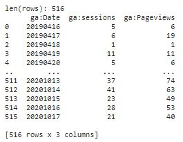
Ok right, now you have your data in the DataFrame dfanalytics. Congratulations, you successfully called the Google API.
2. Forecasting your web traffic
So we have the data. It took already a bit of time but now is the fun part: predicting the web traffic of SolarPanelCompany.

To start this forecasting of the Google Analytics traffic, we need to start importing our packages. We will use Facebook’s Prophet here. This great tool is super easy to use as it uses the same syntax as the package scikit. Facebook themselves use them for all their time series forecasts, be it for web traffic or other.
from fbprophet import Prophet
from fbprophet.plot import add_changepoints_to_plot
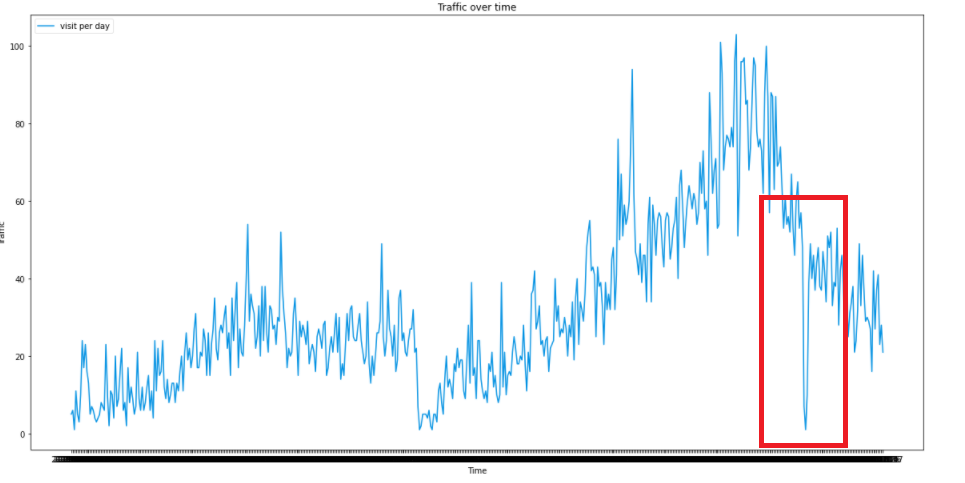
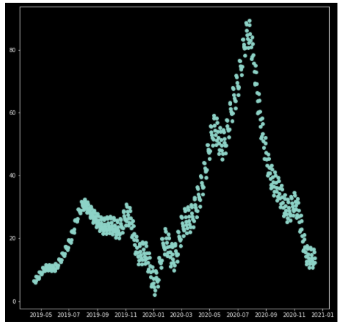
We can now start the fun. Let’s first check how our data is doing. A simple plot does the job.
dfanalytics.plot()
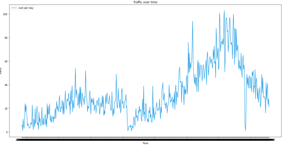
We can already see a strong seasonality in the data. Indeed, this is the data about solar panels. The seasonality is thus expected: it grows smoothly from February to July, as the sun get more and more intense. Then, in August people know it’s too late to enjoy the sun.
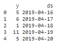
Back to our code, let’s check what the prophet has to say. Facebook’s prophet requires you to change the name your two columns:
- the value column needs to be called ‘y’
- the timestamp needs to be ‘ds’ and be a DateTime variable.
df = dfanalytics
df['ds'] = pd.to_datetime(df['ga:Date'])
df.rename(columns={'ga:sessions': 'y'}, inplace= True)
df.drop(['ga:Date', 'ga:Pageviews'], axis=1, inplace=True)
2.1 Missing data
Although Facebook claims that Prophet is well resistant against missing data and outliers, it’s never bad to get rid of them. Especially in our case: let’s say that the tracking of the website crashed for one day or two, you don’t want this to influence.
missing_dates = pd.date_range(start = '2019-04-16', end = '2020-12-29' ).difference(df['ds'])
print(missing_dates)
If you have some missing data, as I had, you will input them in a new DataFrame. You also need to assign a value to it. I personally used the 7 days moving average.
df_missing_dates = pd.DataFrame(missing_dates)
df_missing_dates.columns = ['ds']
list_replace_values = [20, 15, 21] #here is our moving average
df_missing_dates['y'] = list_replace_values
Then we concat the frameworks together and put a cap and a floor. The floor is “0” as you know you won’t have negative traffic. On the other hand, the cap is purely “human-in-the-loop” work, so based on your good judgment. This cap and floor will help create the boundaries of the model.
df = pd.concat([df2, df_missing_dates])
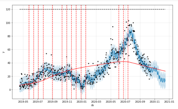
df['cap'] = 120
df['floor'] = 0
df.sort_values('ds', inplace=True)
2.2 EDA
That will be quick as we don’t have so many features; only the value of the observation itself.
df['y'].plot()
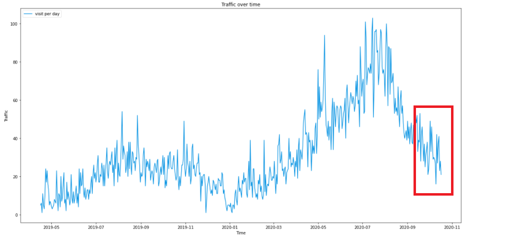
We see that there are no more outliers than the missing data, we can keep on.
2.3 Forecasting our web traffic: the training
Training the model with Prophet is really easy. The team copied the mechanism used is scikit packages: .fit() and .predict()
2.3.1 Creating a model
So first we create the model. There are numerous variations that can be added. I will explain my choices below.
model = Prophet(changepoint_prior_scale=0.5, changepoint_range=0.9, seasonality_mode='multiplicative', yearly_seasonality = 10)
model.fit(df)
- Changepoint_prior_scale: to cope with the underfitting. Increasing makes the trends more flexible (so visually broadening the end funnel)
- Changepoint_range: By default, Prophet changes the slope of the trend only of the first 80% of the data. I here set 0.9 for it to include 90% of the data.
- seasonality_mode=’multiplicative’ as parameters, because the seasonality grows in influence. We clearly see that our business is growing following a multiplicative trend and not a linear one.
- yearly.seasonality = 20. It was 10 but I want more. This number represents Fourier’s Order.
If you want to adapt your model under different criteria, I recommend having a look in the Facebook’s Prophet Github.
2.3.2 Building the forecast timestamp set.
Until now, we have trained our model on our previous data. In order to forecast future web traffic, we first need to create future timestamps. Here I will create 60 days, so two months in the future.
#Forecasting
future = model.make_future_dataframe(periods= 60)
future['cap'] = 120
future['floor'] = 0
print(future.tail())
2.3.3 Predicting the future
Here we go. In the next two lines, we will finally forecast our website traffic from Google Analytics.
forecast = model.predict(future)
forecast.tail()
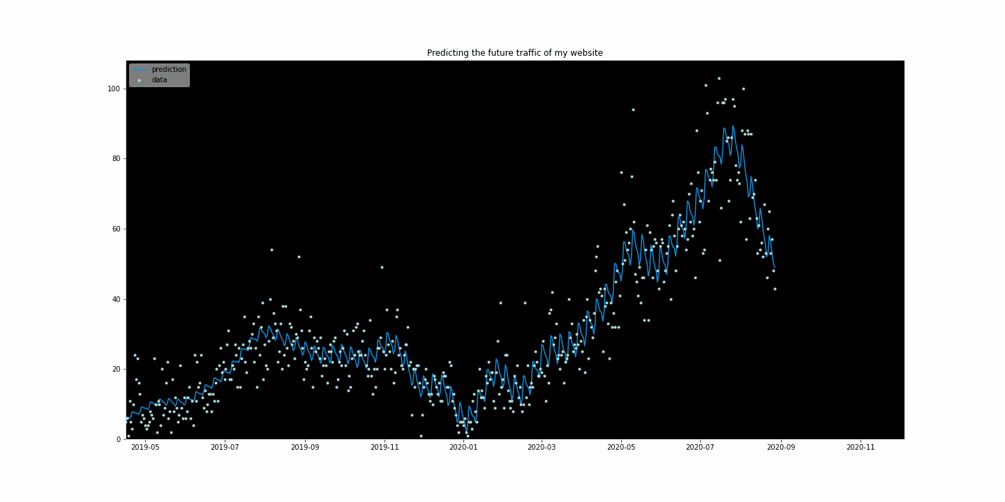
model.plot(forecast)
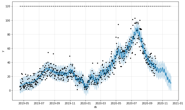
And Voilà! We can see the beauty of my traffic jumping off the cliff in November and December.
2.3.4 Analyzing components
Prophet has another great function: it can show the different components in a graph.
model.plot_components(forecast)
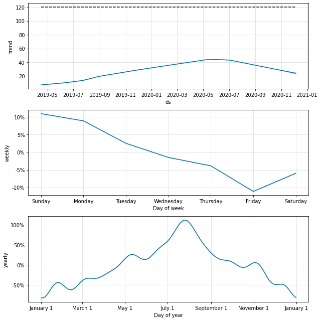
There are already some interesting conclusions:
- The overall trend shows a decline. This is to be taken with a grain of salt, knowing that my growth is multiplicative, and thus the Fall 2020 push the trends downwards heavily.
- The weekly trend: Thursday to Saturday is the worst moment. Sunday is a great moment if I want to advertise.
- Yearly: that is very insightful. We can see the peak on the first of August. Also, we can see that Christmas searches do not bring much revenue. So the fruitful period is April to the end of October.
That’s already some great insights that I can give back to the marketing manager. Not only I can advise on the day where they should spend more ads budget, but I can also ensure that yes: it’s normal to see a down in our traffic. And it will recover only in February.
Also interesting is to see the overall trends compare to the data. We can see here when the trend changes.
fig = model.plot(forecast)
a = add_changepoints_to_plot(fig.gca(), model, forecast)
2.4 Testing the model
Great, now we have done most of the work to predict our Google Analytics traffic. But as rigorous Data Scientists, we also want to test the model.
The testing for time series is slightly different than for traditional models. We need to work with a rolling window: rolling windows means using 60 days of data and assessing how well it predicted against the next 30 days of data.
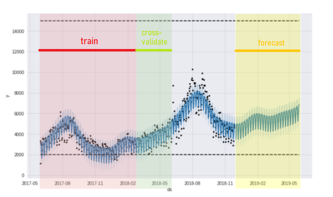
The red part is the data used to cross-validate the green part. The yellow part is the forecast.
In this graph above for instance, the red part is used to predict the green part. After cross-validation, the red part will move forward in time to take the next 60 days and again, predicts the next 30 days. This is the concept of the rolling windows. Coding-wise, it’s written as follow:
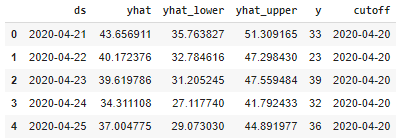
from fbprophet.diagnostics import cross_validation
df_cv = cross_validation(model, horizon = '30 days', parallel="processes")
df_cv.head()
# Performance metrics
from fbprophet.diagnostics import performance_metrics
df_p = performance_metrics(df_cv)
df_p.head(20)
# Visualizing the performance metrics
from fbprophet.plot import plot_cross_validation_metric
fig = plot_cross_validation_metric(df_cv, metric='rmse')
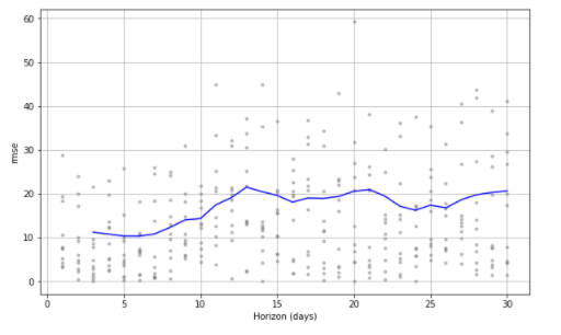
And here we are. We now have the RMSE plotted against the horizon in day. As we can see, the further the horizons, the bigger the error.
Now for the sake of your own work, you can play with the hyperparameters of the model to try to push this down. As we are using this graph for marketing purposes and not for engineering ones, such an RMSE is good enough.
3. Visualization
So in the first part, I fetched my data and in the second part, I created the model. Now, it’s time to make it nice so that the Marketing Manager and the CMO are excited about it. Human-truth: having something pleasant to look at makes it more valuable, so time to make my work valuable.
For pure attention purposes, I had the fun to create a giphy. This kind of animation can really hook on the attention, and thus the interest from the stakeholders to my project.
3.1 Data plotting
Let’s start by importing the packages:
import matplotlib.pyplot as plt
import numpy as np
import matplotlib.animation as animation
from matplotlib import style
from datetime import datetime
from matplotlib.animation import FuncAnimation, PillowWriter
%matplotlib inline
We want it catchy, so we will directly start with a stylish element: the dark background.
with plt.style.context('dark_background'):
    fig = plt.figure(figsize=(10,10))
    plt.subplot(1,1,1)
    plt.plot(forecast['ds'], forecast['yhat'], linewidth=0,marker="o")
Very nice effect. Let’s now plot our prediction
3.2 Plotting the prediction make it gif
We first need to create one dataframe containing both our data and our prediction.
df3 = forecast.merge(df2, on='ds', how = 'left')
df3.tail()
Ok that was the easy part, now we will have the big block to create our GIF. To pursue here, be sure to have installed PillowWriter or Imagemagick, these are the ones which will transform your image in GIF.
The difference between a classic fig, ax matplotlib operation is that we will need to create a function to animate the diagram.
with plt.style.context('dark_background'):
    fig = plt.figure(figsize=(20,10))
    #creating a subplot
    ax1 = fig.add_subplot(1,1,1)


#creating the animation function.
    def animate(i):

        lines =  df3.iloc[0:int(i+500)] #   set the variable data to contain 0 to the (i+1)th row. I wanted only the last data and the predictions to be animated, so put i+500.

        xs = []
        ys = []
        zs = []
        for line in lines:
            if len(line)>1:
                xs = lines['ds']
                ys = lines['yhat']
 #the predictions
                zs = lines['y']
    #the normal data point

# Creating the ax labels, title, legend and plotting value
        ax1.clear()
        ax1.set(title='Predicting the future traffic of my website',xlabel= "Time", ylabel='Traffic')
        ax1.axis(xmin= (df3['ds'].min()), xmax=(df3['ds'].max()))
        ax1.axis(ymin= (df3['y'].min()-1), ymax=(df3['y'].max()+5)) #adding a bit of margin with -1 and +5

        ax1.plot(xs, ys, label='prediction', color='#0693e3')
        ax1.plot(xs, zs, marker = '.' ,linewidth = 0.0, label='data', color='#afdedc') #linewidth is not visible at 0.1, I change to 0.3
        ax1.legend(loc='upper left', frameon=True, framealpha = 0.5 )
The operation ax.clear() is super important. If you fail to put it, like I did, the animation will create a new graph on top of the previous one. Not terrible, except if.. each new graph has a new color. The final animation will be a rapidly blinking graph changing color every quarter of a second. Enough to kill epileptic people.

writergif = animation.PillowWriter(fps=30)

#here is the animation.
ani = animation.FuncAnimation(fig, animate, frames = (len(forecast)-len(df2)+30), interval=10)
plt.show()

#and export
writergif = animation.PillowWriter(fps=30, metadata=dict(artist='Arthur_Moreau'))
ani.save('animation_video.gif', writer=writergif)
Note that if you are working in a notebook, you won’t see the animation in your graph. You have to download the ‘animation_video.gif’ created to actually see the animation.
Here you are, proud of your long working hours and ready to rock the stage with your stunning animation. You can now tell how will the future of your business looks like!
Conclusion
After fetching the data from Google Analytics API, I could plot a time series of our future web traffic in a GIF.
These visually appealing results helped the marketing manager and the CMO understand that yes, it was normal if the traffic would go down in winter. And yes, it would grow back in Spring, when the sun comes back and people think about solar energy investment.
Guess which company is starting to invest more in their data team.
Going futher
Your business manager doesn’t understand how a prediction works and how you work? You might be interested by How to explain predictive modelling to managers